Okay. Let's do this.
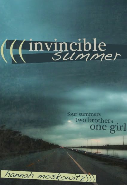
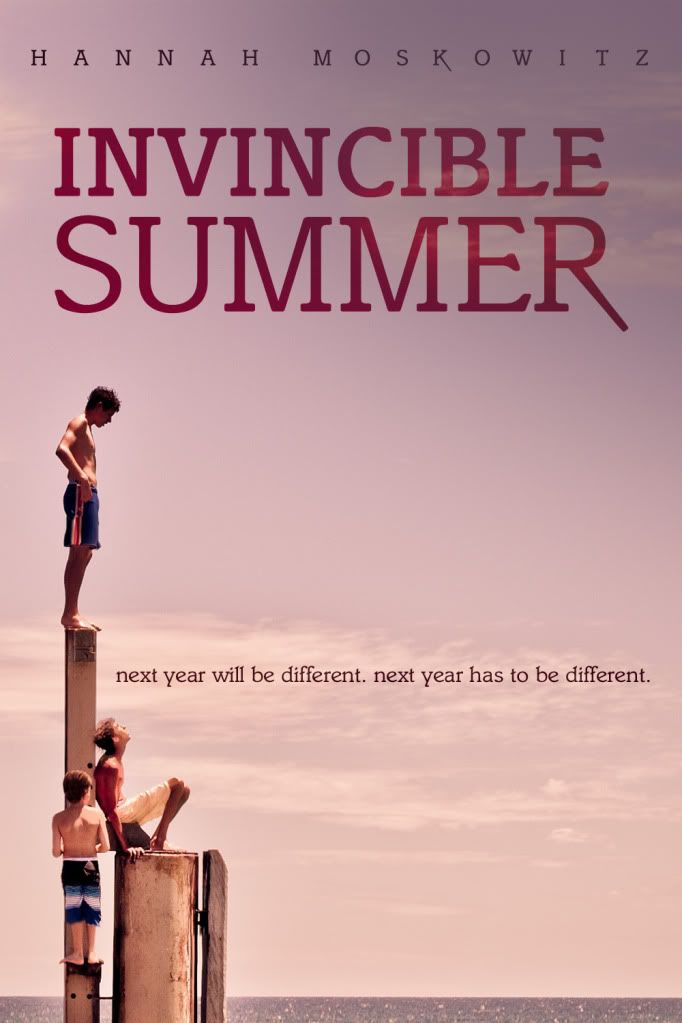
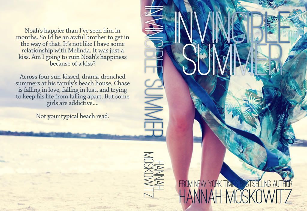
Here are our Top Four in the INVINCIBLE SUMMER COVER REDESIGN CONTEST! These are the 3 from my Top Ten that received the most votes, and the fan favorite you all picked from the remaining entries! I've scrambled their order just for kicks.
You may vote ONCE for ONE cover. Each cover's number is above it. Remember you can click each to make it bigger.
And so you remember what a big deal this is, the winner will receive...
--a signed copy of my first book, BREAK.
--a signed copy of my second book, INVINCIBLE SUMMER.
--a signed arc of my first MG book, ZOMBIE TAG.
--a signed arc of my third YA book, GONE, GONE, GONE.
--their cover, printed up on pretty photo paper, signed by me (if you want me to? It's your art, you might not be into that. Let me know.)
--however many bookmarks I have lying around (three?) signed by me.
AND. MOST IMPORTANTLY:
--the first chapter of my just-sold novel, FISHBOY, printed out and signed. This is pre-edits! Who knows if this chapter will even EXIST in the final draft?? This is a first look that ONLY YOU WILL RECEIVE.
You have until MONDAY, SEPTEMBER 19TH, MIDNIGHT EST to cast your vote.
WITHOUT FURTHER ADO:
#1
#2
#3
#4


7 comments:
I'm going to have to pick #2. It looks good and it fits the story.
I second the Girl in the Tower: 2 is my favorite. I love the quiet, tense feel about it.
They're all so good! I'm having trouble deciding...
The first one doesn't look like summer to me! I picked number two, but since I haven't read the book, I wonder if it is about three boys.
#2 a hundred times. Oh? Only one vote? Well then, just once.
Already voted, my favourite is #2.
Is the one at least for me that represents summer.
#2 seems to be the front-runner and I have to agree. It really speaks to me about the story.
Post a Comment